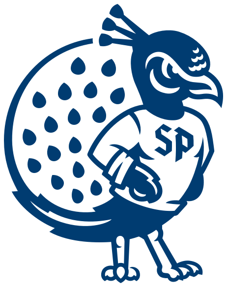
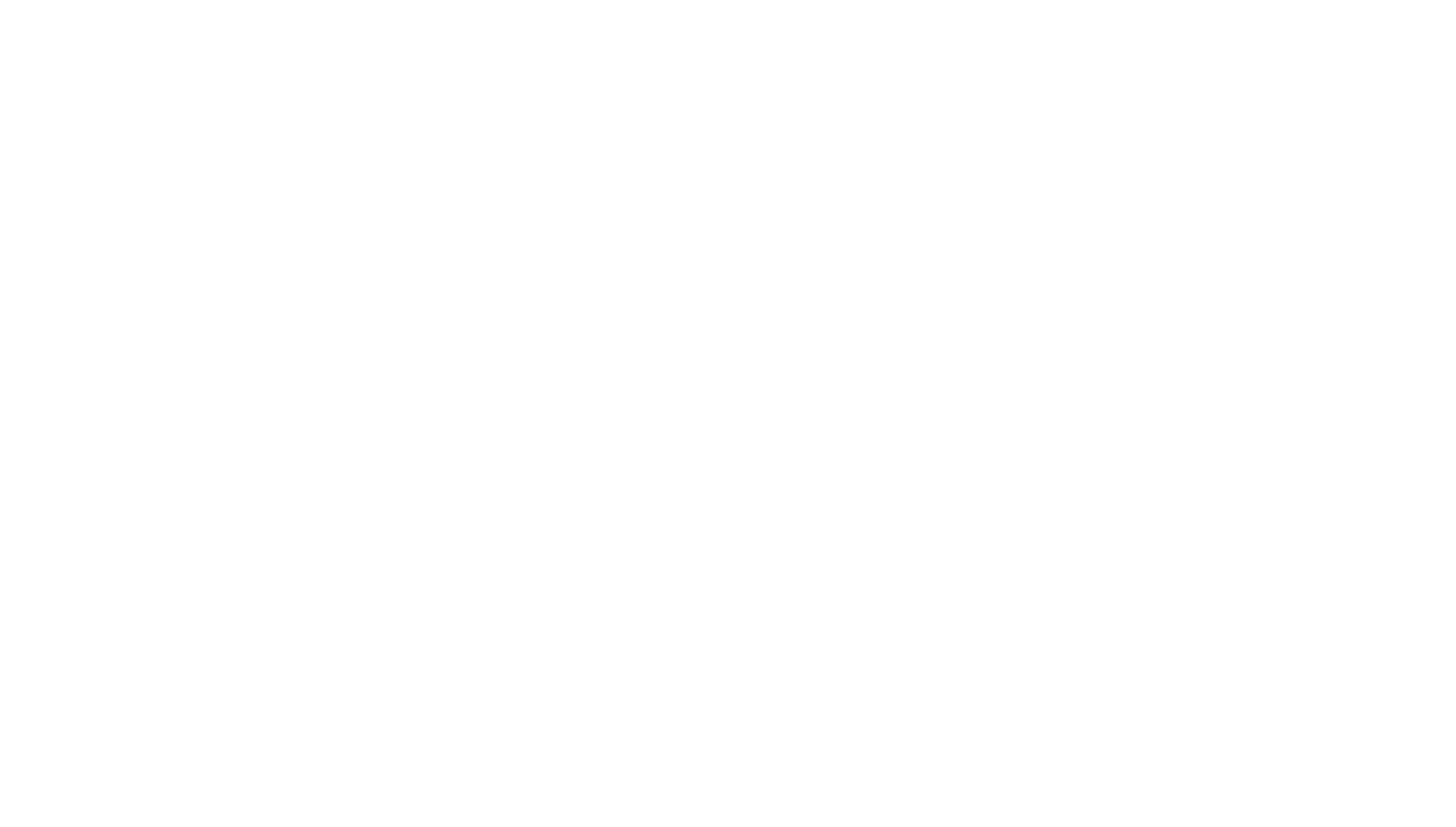
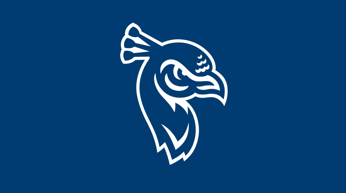
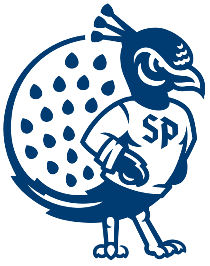
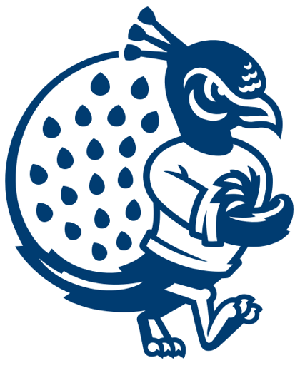
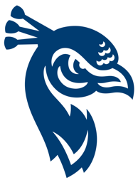
Spirited and determined by nature, our peacock never backs down from a challenge. This simplified evolution of our previous mark alludes to the hard-working nature of our students, our university and our city.
The subtle depiction of flames signifies rebirth, associated symbolically with a peacock and the university as it reopened in 1930 following its closure during World War I.
SP Monogram
The new primary mark is built on the foundation of clean, simple lines influenced by modern depictions of blackletter/gothic typography associated with early printed forms of the Bible and inspired by stained glass windows of St. Aedan's church nestled within the Saint Peter's urban campus.
This monogram is uniquely constructed of both an 'elevated' ST for Saint and a P for Peter's.
Peacock Strut
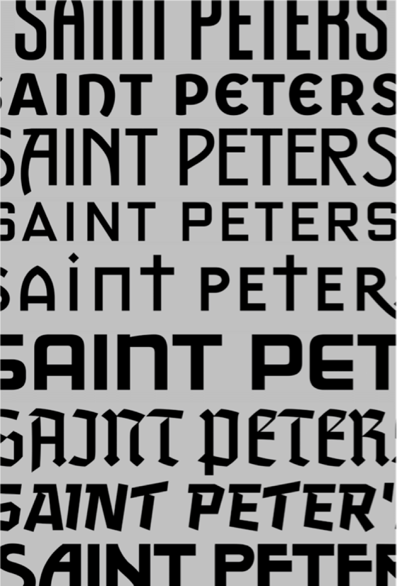
SP Logotype
Peacock Perch
The creative development process, spearheaded by VPCo., began in the summer of 2019 and included a number of presentations, input sessions and feedback from coaches, staff, student-athletes and other key constituents from across the Saint Peter's University campus. At its core, the mission of the rebrand was to create a simplified identity system that evokes the hard-working spirit of the Saint Peter's University community while harnessing the energy of the fanbase to build on established legacy and tradition.
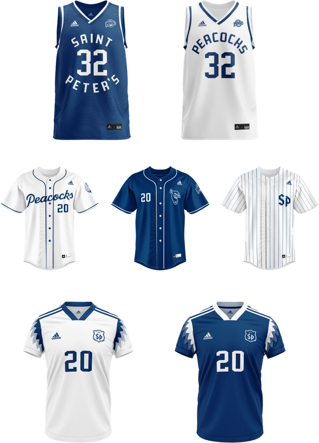
The end result: a refreshed and modernized visual identity that showcases the determined and diligent spirit of Saint Peter's Athletics. The initiative comes on the heels of one of the most successful athletic academic years in recent memory, and the rebrand aims to keep pushing that department-wide momentum with new branding elements that will enhance uniforms, facilities (including the recently announced Yanitelli Center renovation project), merchandise, digital media and print applications.
At the project's core, the mission was to create a simplified identity system that evokes the blue-collar spirit of the community and harnesses the energy of our fanbase to build on established legacy and tradition... but most importantly, we want a visual identity and a brand that anyone involved in Saint Peter's University -- past, present, future -- will take great pride in. The kind of pride we have when we're labeled the underdog before the whistle blows; the pride we show when, despite being underestimated, we let our grit and our spirit do our talking for us.
Having one of the most unique mascots in all of collegiate athletics at our disposal only enhances the possibilities of what our student-athletes will wear when they take the court, field, pitch, pool, track and everywhere in between. When they do, they'll do so with Peacock Pride.
The Saint Peter's University Athletic Department is excited to unveil a revamped visual identity and branding platform today ahead of the start of the 2020-21 academic year.
Comprised of a revamped branding package that incorporates a fresh take on the peacock mascot logos, a brand-new monogram, an updated wordmark, a unique typeface and a variety of new spirit marks round out a comprehensive department-wide rebrand that makes one of the country's most unique collegiate athletics mascots (and the only such mascot in the NCAA Division I ranks) stand out even further.
The creative development process, spearheaded by Varsity Partners, began in the summer of 2019 and included a number of presentations, input sessions and feedback from coaches, staff, student-athletes and other key constituents from across the Saint Peter's University campus. At its core, the mission of the rebrand was to create a simplified identity system that evokes the hard-working spirit of the Saint Peter's University community while harnessing the energy of the fanbase to build on established legacy and tradition.
The end result: a refreshed and modernized visual identity that showcases the determined and diligent spirit of Saint Peter's Athletics. The initiative comes on the heels of one of the most successful athletic academic years in recent memory, and the rebrand aims to keep pushing that department-wide momentum with new branding elements that will enhance uniforms, facilities (including the recently announced Yanitelli Center renovation project), merchandise, digital media and print applications.
At the project's core, the mission was to create a simplified identity system that evokes the blue-collar spirit of the community and harnesses the energy of our fanbase to build on established legacy and tradition... but most importantly, we want a visual identity and a brand that anyone involved in Saint Peter's University -- past, present, future -- will take great pride in. The kind of pride we have when we're labeled the underdog before the whistle blows; the pride we show when, despite being underestimated, we let our grit and our spirit do our talking for us.
Having one of the most unique mascots in all of collegiate athletics at our disposal only enhances the possibilities of what our student-athletes will wear when they take the court, field, pitch, pool, track and everywhere in between. When they do, they'll do so with Peacock Pride.
The Saint Peter's University Athletic Department is excited to unveil a revamped visual identity and branding platform today ahead of the start of the 2020-21 academic year.
Comprised of a revamped branding package that incorporates a fresh take on the peacock mascot logos, a brand-new monogram, an updated wordmark, a unique typeface and a variety of new spirit marks round out a comprehensive department-wide rebrand that makes one of the country's most unique collegiate athletics mascots (and the only such mascot in the NCAA Division I ranks) stand out even further.
The new primary mark is built on the foundation of clean, simple lines influenced by modern depictions of blackletter/gothic typography associated with early printed forms of the Bible and inspired by stained glass windows of St. Aedan's church nestled within the Saint Peter's urban campus.
This monogram is uniquely constructed of both an 'elevated' ST for Saint and a P for Peter's.
Spirited and determined by nature, our peacock never backs down from a challenge. This simplified evolution of our previous mark alludes to the hard-working nature of our students, our university and our city.
The subtle depiction of flames signifies rebirth, associated symbolically with a peacock and the university as it reopened in 1930 following its closure during World War I.
Peacock Perch
SP Logotype
Peacock Strut
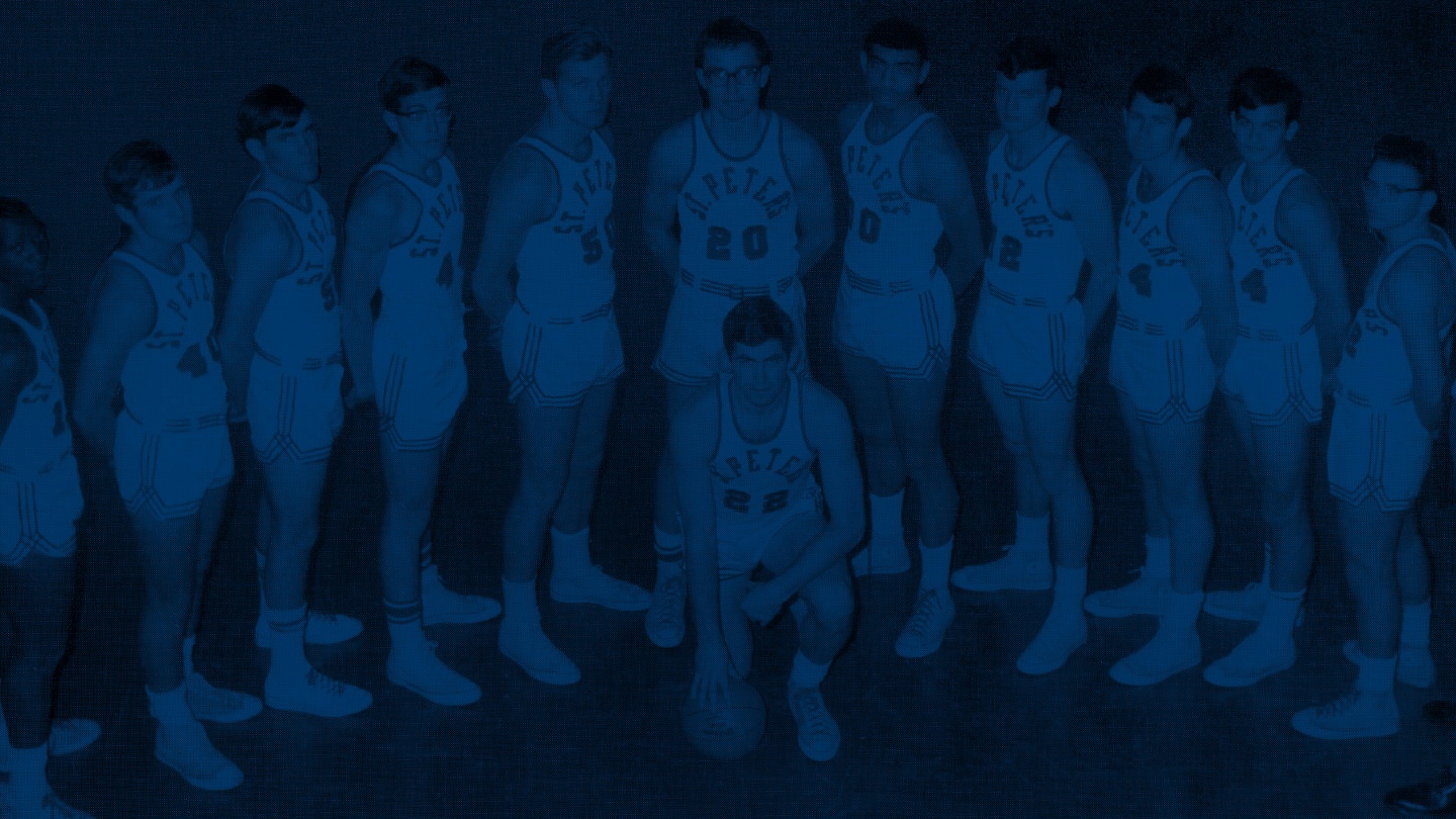
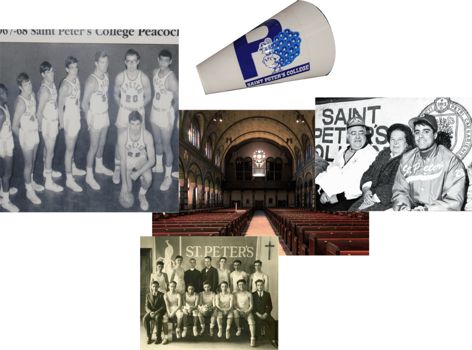
Saint Peter's University Athletics Rebrand
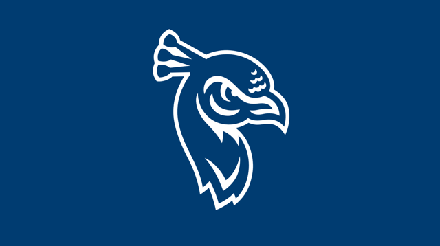
Peacock Head
Spirited and determined by nature, our peacock never backs down from a challenge. This simplified evolution of our previous mark alludes to the hard-working nature of our students, our university and our city.
The subtle depiction of flames signifies rebirth, associated symbolically with a peacock and the university as it reopened in 1930 following its closure during World War I.
SP Monogram
The new primary mark is built on the foundation of clean, simple lines influenced by modern depictions of blackletter/gothic typography associated with early printed forms of the Bible and inspired by stained glass windows of St. Aedan's church nestled within the Saint Peter's urban campus.
This monogram is uniquely constructed of both an 'elevated' ST for Saint and a P for Peter's.
Peacock Strut
SP Logotype
Peacock Perch
The creative development process, spearheaded by Varsity Partners, began in the summer of 2019 and included a number of presentations, input sessions and feedback from coaches, staff, student-athletes and other key constituents from across the Saint Peter's University campus. At its core, the mission of the rebrand was to create a simplified identity system that evokes the hard-working spirit of the Saint Peter's University community while harnessing the energy of the fanbase to build on established legacy and tradition.
The end result: a refreshed and modernized visual identity that showcases the determined and diligent spirit of Saint Peter's Athletics. The initiative comes on the heels of one of the most successful athletic academic years in recent memory, and the rebrand aims to keep pushing that department-wide momentum with new branding elements that will enhance uniforms, facilities (including the recently announced Yanitelli Center renovation project), merchandise, digital media and print applications.
At the project's core, the mission was to create a simplified identity system that evokes the blue-collar spirit of the community and harnesses the energy of our fanbase to build on established legacy and tradition... but most importantly, we want a visual identity and a brand that anyone involved in Saint Peter's University -- past, present, future -- will take great pride in. The kind of pride we have when we're labeled the underdog before the whistle blows; the pride we show when, despite being underestimated, we let our grit and our spirit do our talking for us.
Having one of the most unique mascots in all of collegiate athletics at our disposal only enhances the possibilities of what our student-athletes will wear when they take the court, field, pitch, pool, track and everywhere in between. When they do, they'll do so with Peacock Pride.
The Saint Peter's University Athletic Department is excited to unveil a revamped visual identity and branding platform today ahead of the start of the 2020-21 academic year.
Comprised of a revamped branding package that incorporates a fresh take on the peacock mascot logos, a brand-new monogram, an updated wordmark, a unique typeface and a variety of new spirit marks round out a comprehensive department-wide rebrand that makes one of the country's most unique collegiate athletics mascots (and the only such mascot in the NCAA Division I ranks) stand out even further.
The new primary mark is built on the foundation of clean, simple lines influenced by modern depictions of blackletter/gothic typography associated with early printed forms of the Bible and inspired by stained glass windows of St. Aedan's church nestled within the Saint Peter's urban campus.
This monogram is uniquely constructed of both an 'elevated' ST for Saint and a P for Peter's.
SP Monogram
Spirited and determined by nature, our peacock never backs down from a challenge. This simplified evolution of our previous mark alludes to the hard-working nature of our students, our university and our city.
The subtle depiction of flames signifies rebirth, associated symbolically with a peacock and the university as it reopened in 1930 following its closure during World War I.